Suicide Analysis
Welcome to my Data project. It is a analysis on the suicide rates worldwide based on gender.
Features
- Ability to clearly see the number of suicides worldwide
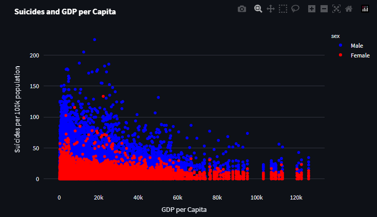
- Compare suicides based on gender and deduct reasoning
- Compare 2 datasets (suicides and U.S. Happiness) to better explain hypothesis
![]()
![]()
![]()
![]()
![]()
Open GitHub Repo »
View Demo
·
Report Bug
·
Request Feature
Built With
Function used to plot correlation
1
2
3
4
5
6
7
8
9
10
11
12
13
14
15
16
17
18
19
20
21
22
23
24
25
26
27
28
29
def corrfunc(x, y, **kwargs):
    def pvalue_stars(p):
        if 0.05 >= p > 0.01:
            return '*'
        elif 0.01 >= p > 0.001:
            return '**'
        elif p <= 0.001:
            return '***'
        else:
            return ''
    cmap = kwargs['cmap']
    norm = kwargs['norm']
    ax = plt.gca()
    ax.grid(False)
    r, p = pearsonr(x, y)
    facecolor = cmap(norm(r))
    ax.set_facecolor(facecolor)
    lightness = (max(facecolor[:3]) + min(facecolor[:3])) / 2
    ax.annotate(f"{r:.2f}{pvalue_stars(p)}", xy=(.5, .5), xycoords=ax,
                color='white' if lightness < 0.7 else 'black',
                size=18, ha='center', va='center')

g = sns.PairGrid(masterCat, height=1.5, diag_sharey=False)
g.map_lower(sns.scatterplot)
g.map_upper(corrfunc,
            cmap=plt.get_cmap('RdBu_r'),
            norm=plt.Normalize(vmin=-1, vmax=1))
g.add_legend()
plt.show()
A graph used in the analysis
1
2
3
4
5
6
7
8
9

suicides_gender_USA = px.line(test, x='year',y='percapita')
suicides_gender_USA.data[0].name="Male"
suicides_gender_USA['data'][0]['line']['color']='rgb(23, 54, 255)'
suicides_gender_USA.update_traces(showlegend=True)

suicides_gender_USA.add_scatter( x=testWomen['year'],y=testWomen['percapita'],name='Women')
suicides_gender_USA['data'][1]['line']['color']='rgb(237, 9, 9)'
This post is licensed under
CC BY 4.0
by the author.